AID-696 — All five search bars CK flagged, now consistent
Verified end-to-end on iOS simulator with Metro running from lisherwin/aid-696-search-audit. Every screen below mounts the same Strata persistent nav bar search slot — 40 px height, 20 px magnifying-glass icon, clear button while editing, and the same "Search" placeholder (i18n key commandSearch). Single primitive, single placeholder, no per-screen overrides.
1. Settings slot default
phantom://SettingsStack · testID settings-search
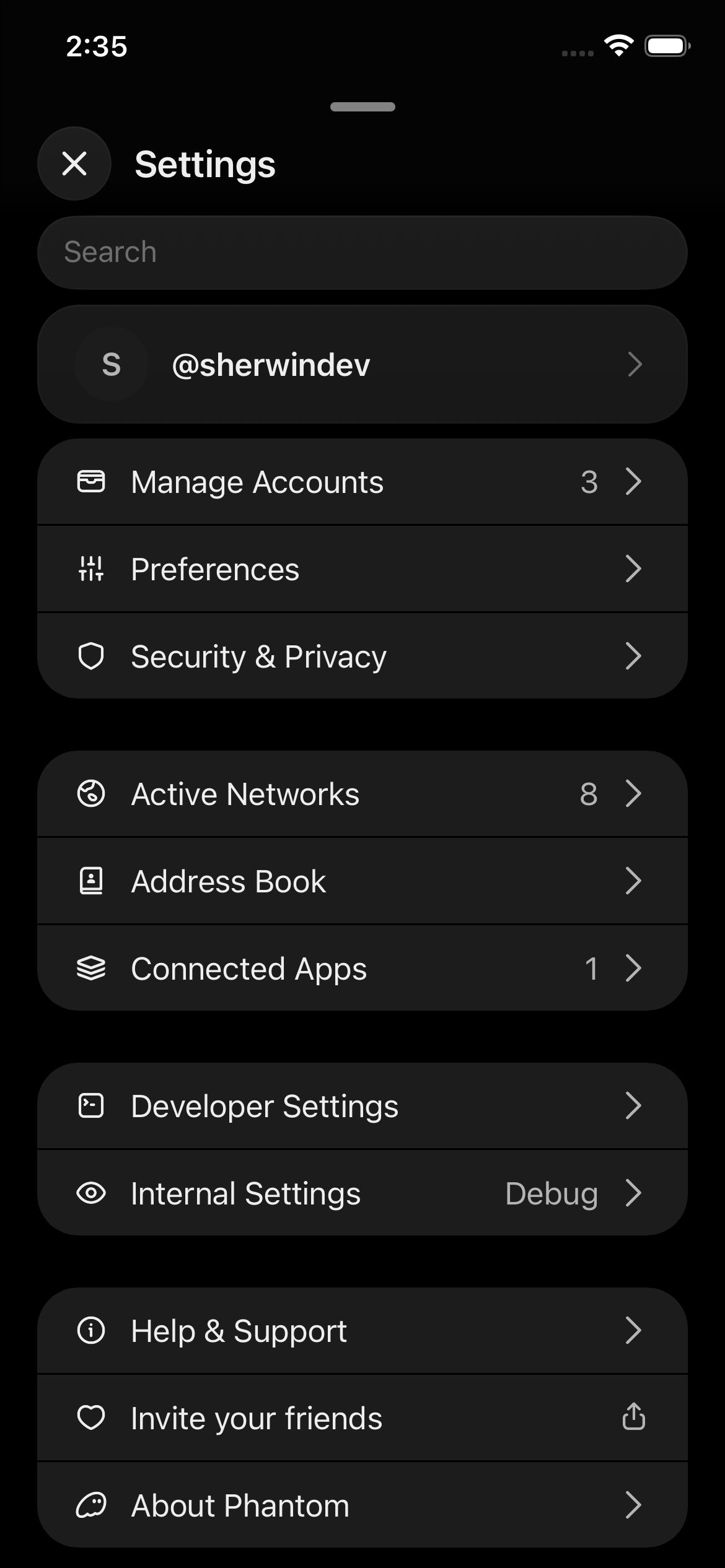
Slot rendered a bare InputField — no icon, no clear button.
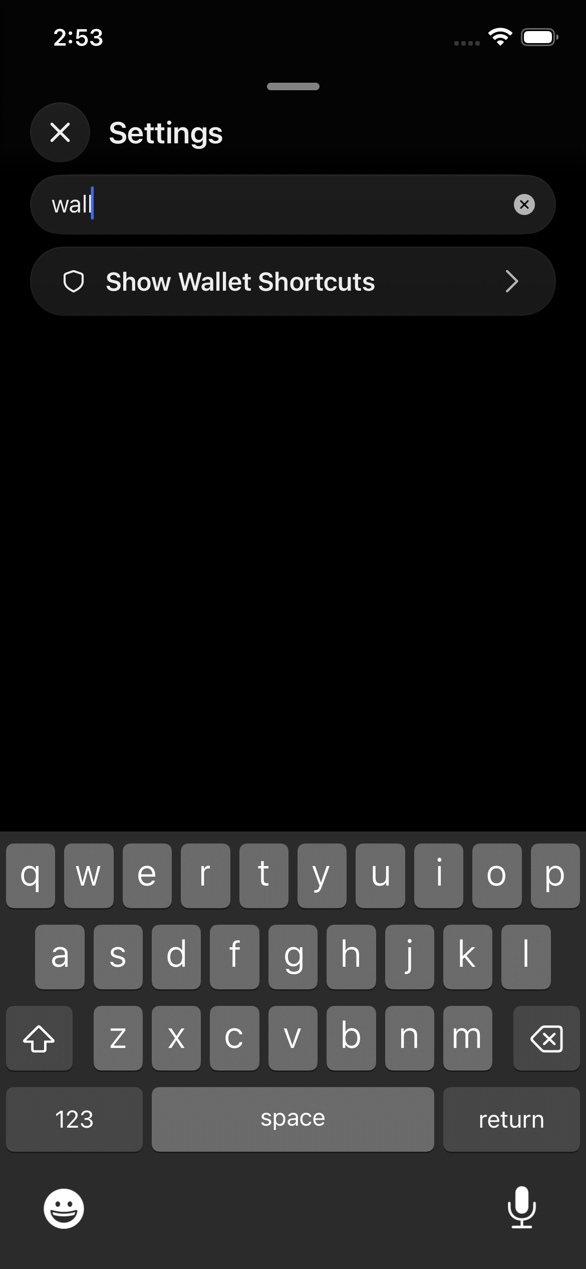
Slot now renders IconMagnifyingGlass 20 px + clearButton="while-editing". Live-filters as you type.
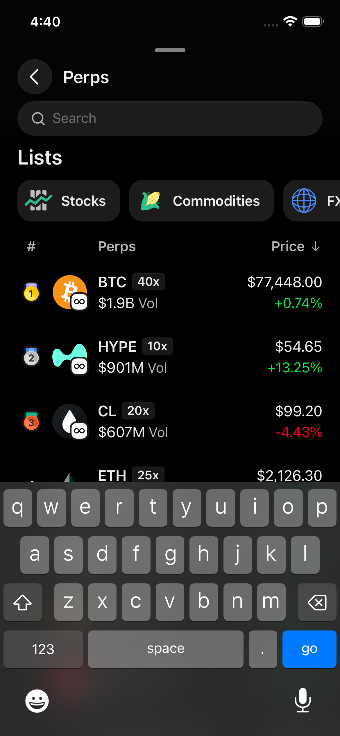
2. Validator list (staking) slot default
SOL detail → More → Stake SOL → Native Staking · testID persistent-nav-bar-search
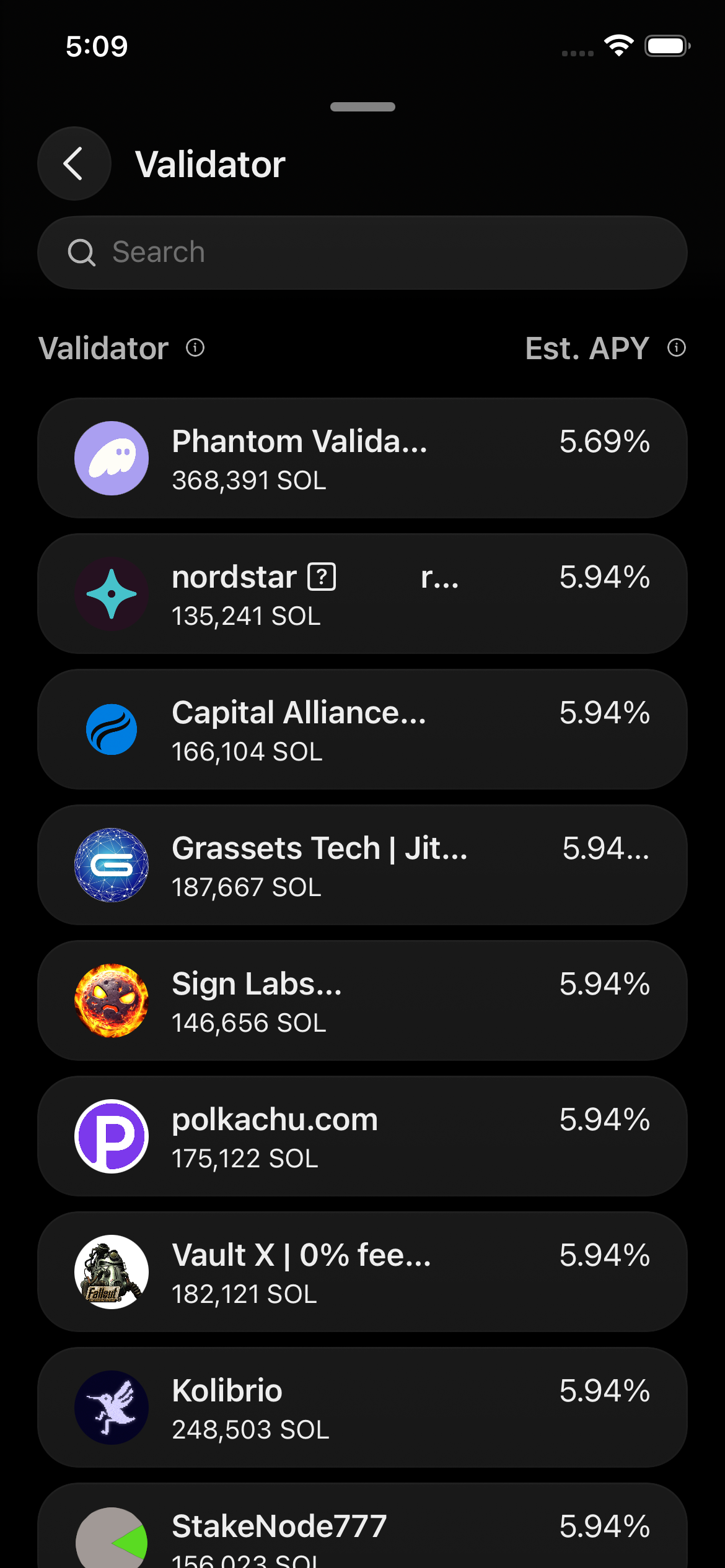
This is the screen that prompted CK's audit — it was previously a slim, iconless input. No consumer-side change was needed; ValidatorListPage already calls useNavBar({ search }), so the slot's new icon + clear button render for free.
Same look as Settings, same look as every other PNB-mounted search.
3. Manage Tokens (Fungibles visibility) migrated to slot
Home → tokens section → Filter icon · testID persistent-nav-bar-search
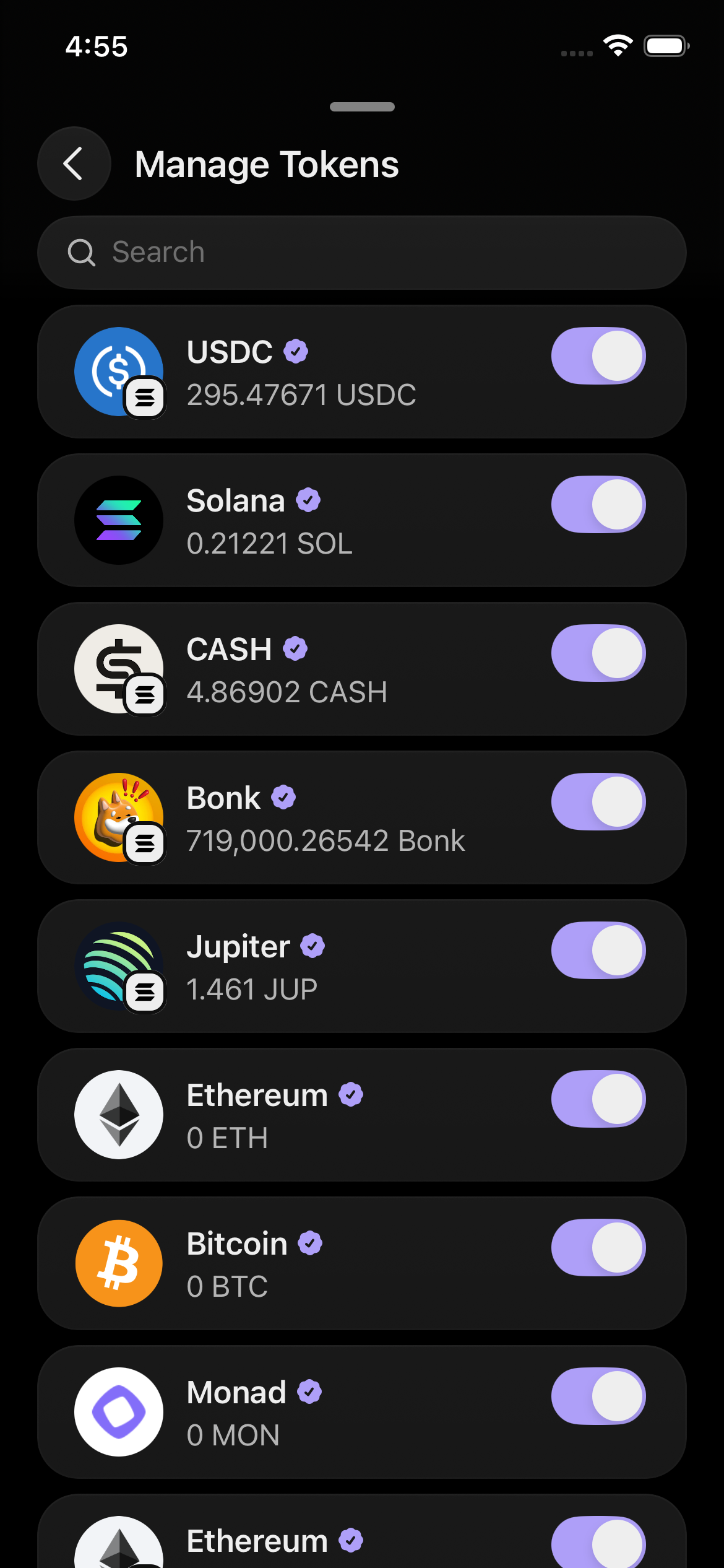
Before: inline InputField size="small" (32 px) with a 16 px magnifying glass — the outlier in CK's audit.
After: FungiblesVisibility.tsx migrated to useNavBarSearch() + useNavBar({ title, search }). Same 40 px / 20 px treatment as every other PNB search.
4. Trending Perps migrated to slot
/perps/exploreTrending · testID persistent-nav-bar-search
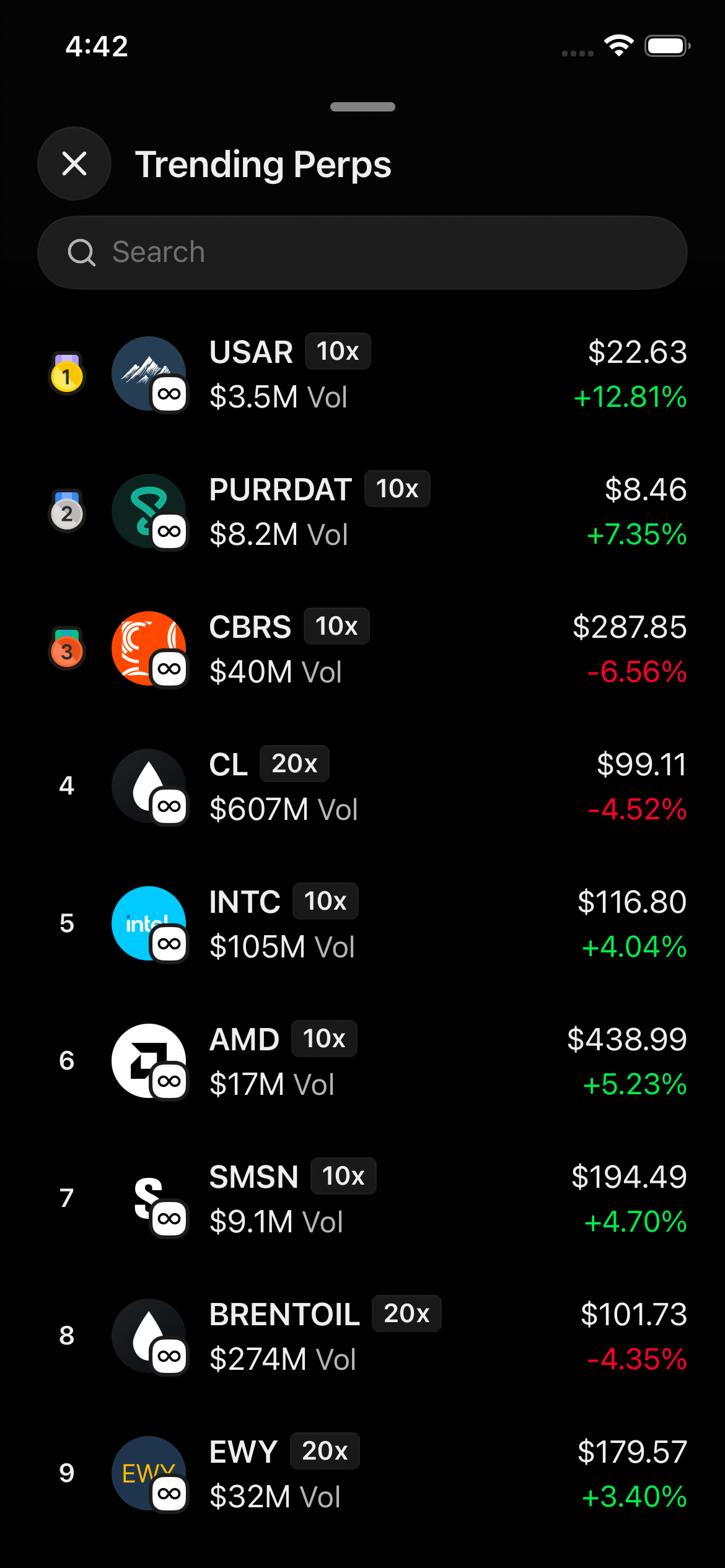
Before: scroll-along ExploreSearchInput wrapper (40 px, 20 px icon, but rendered in page chrome — scrolled away with the list).
After: search lives in the PNB and stays sticky. ExplorePerpsTrendingPage uses the shared useNavBarSearch() hook. The wrapper component is deleted.
5. Collectibles migrated to slot
phantom://collectibles · testID persistent-nav-bar-search

Before: page-level SearchField (a local Virtual.recycle(InputField) wrap) with size="small" 32 px and a 16 px magnifying-glass child — same outlier shape as Manage Tokens.
After: CollectionsPage passes search into useNavBar(...) with the existing searchQuery from useCollectionsPageProps. Local SearchField + SearchGap deleted.
Bonus — Explore Perps search
Trade tab Perps page → "Search" button · testID explore-perps-search-input
The sibling of Trending Perps. ExplorePerpsPage uses a leaf NavBarController child that reads searchQuery from the zustand store and pushes it into useNavBar({ search }) — keeps the page body off the keystroke subscription while still using the slot.
The single source-of-truth change
One slot. Everything else follows:
// apps/mobile/src/features/persistent-nav-bar/slots/Search.tsx
<InputField
  size="base"
  type="search"
  clearButton="while-editing"
  // ... config
>
  <IconMagnifyingGlass color={tokens.colors.legacy.textDiminished} size={20} />
</InputField>
Consumers reach for the shared hook for the rest of the boilerplate:
// any screen with a nav bar
const { debouncedSearchText, search } = useNavBarSearch();
useNavBar({ title, search });
The hook intentionally does not expose a placeholder option — every search bar shows the same "Search" string, sourced from the slot's t("commandSearch") fallback. New search screens get the canonical copy without a per-screen choice.
For form sheets where the PNB isn't available (SelectTokenSheet.native.tsx — fiat onramp + send token select), the page uses InputField directly with the same defaults the slot wires (including the same t("commandSearch") string). One-off, no new primitive.